Event hosts always aim for a successful event; one of the keys to achieving that is a smooth registration process. A well-designed registration form can improve the user experience and encourage more attendees to sign up. In addition, a user-friendly registration process makes attendees more likely to return for future events and recommend them to others.
However, designing a user-friendly registration process can be challenging. Event hosts often need help to balance their desired level of information collection with the need for simplicity and ease of use. Complicated registration forms and clunky interfaces can deter potential attendees from signing up.
In This Blog, You’ll Learn To…
Start with a Simple Registration Form
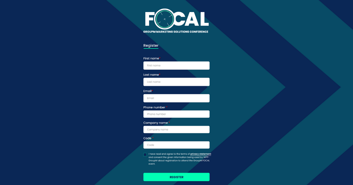
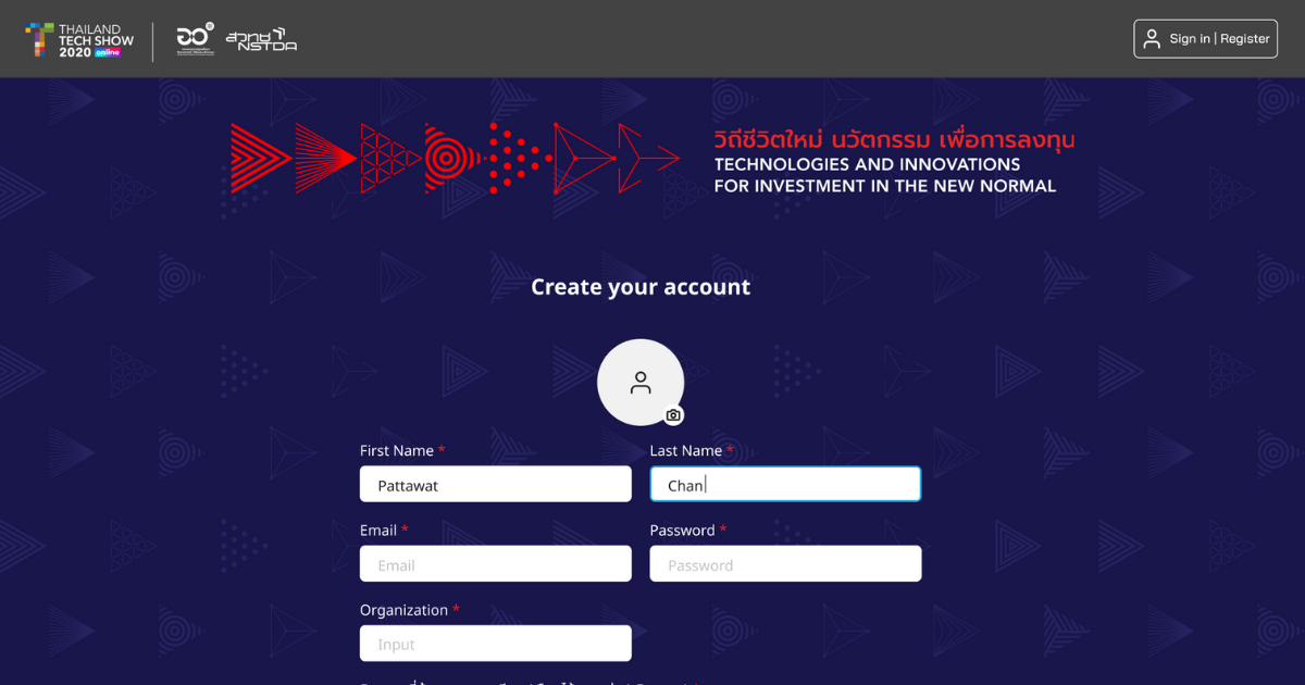
The registration form should be kept simple and straightforward to encourage attendees to register. A short form with essential fields can reduce the time needed to complete registration and increase the sign-up likelihood.

Use a Clear and Concise Call-to-Action (CTA)
A clear and concise CTA can help guide attendees through the registration process. Therefore, the CTA should be prominently placed and easy to locate, preferably at the top of the registration form.
Here are some examples of clear and concise call-to-action (CTA) statements for event registration:
Remember, the key to an effective CTA is to make it clear and concise so attendees know exactly what they’re signing up for and how to do it. Use action-oriented words encouraging attendees to take action and register for your event.
Provide Clear Instructions
Clear instructions can reduce confusion and make the registration process easier for attendees. Clear instructions on how to fill out the registration form can prevent attendees from making mistakes or getting frustrated.
Implement Progress Indicators
Progress indicators can help attendees understand how much more they need to complete the registration process. It can also increase the feeling of accomplishment as they move through each step.

Make Your Registration Form Mobile-Friendly
With the increasing use of mobile devices, it’s essential to have a mobile-friendly registration platform. A mobile-friendly platform can improve the user experience and increase the likelihood of attendees signing up.
Offer Social Media Login Options
Social media login options speed up registration by eliminating attendees needing to create a new account. It can also increase registration completion rates, as attendees can use their existing social media accounts to sign up.
Use Captcha to Prevent Spam
To prevent spam and ensure that only legitimate attendees register, it’s essential to use a captcha. Captcha can help eliminate bots and fake registrations, improving the accuracy of attendee data.
Allow for Multiple Ticket Types
To cater to different attendee needs, offering multiple ticket types is essential. Different ticket types can cater to different budgets, levels of access, and attendee types.

Provide a Preview of the Event Schedule
A preview of the event schedule can give attendees an idea of what to expect from the event. It can also help them decide which ticket type to choose.
Offer Live Chat Support (Optional)
Live chat support can help attendees who have questions or encounter issues during the registration process. It can also improve the user experience by providing quick and efficient assistance.
Conclusion
Designing a user-friendly registration process is crucial to the success of any event. By following these ten tips, event hosts can create a smooth and hassle-free registration process, leading to increased attendance rates and a more successful event.
Let Happenn Help You Design a User-Friendly Event Registration Platform
If you need help designing a user-friendly event registration platform, Happenn is here to help. Our team of experienced designers and developers can create a customized registration process that aligns with your event’s needs and goals. In addition, we prioritize user experience, ensuring that your attendees can quickly and easily sign up for your event.
If you want to learn more about how Happenn can help you design a flawless registration process, click this link to contact us or email us at hello@happenn.com to start the conversation. With Happenn’s expertise and attention to detail, you can ensure that your event registration process is efficient, effective, and user-friendly.

